Sliding into 2023
30 Dec 22
32 Comments
A quick hello from Germany to say that I hope you have, as the Germans say, a good slide into the New Year.
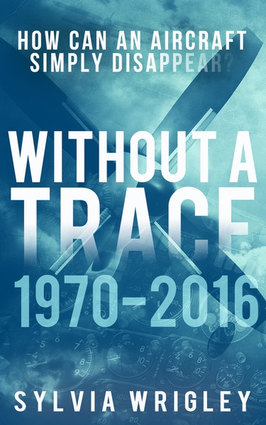
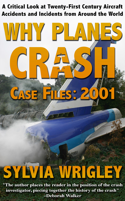
I’m also excited to tell you that my next book will be coming out in March. I’ll tell you more about it soon but today I want to offer you a sneak peek at the cover, designed by the talented Wendy Nikel, which I absolutely love.
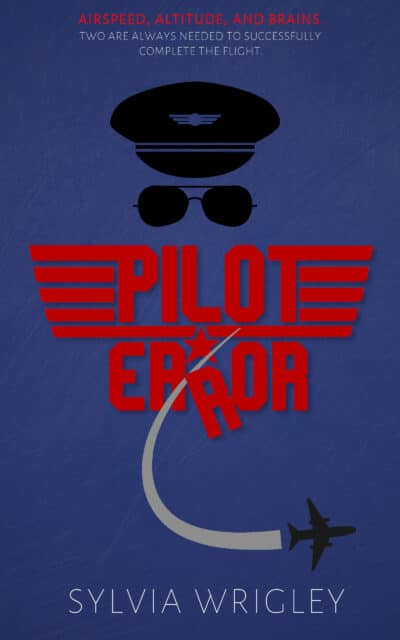
What do you think?
See you on the other side.
Category:
Miscellaneous
Can’t wait to pick this one up.
The cover reminds me of Hot Shots!
I hope that’s a good thing!
It is!
Sylvia,
Thanks for all the entertaining and blogs!
My computer has been acting up, and I am still very busy driving and guiding tourists in Ireland, even on Christmas Eve and New Year’s day!
But anyway, gleichfalls einen guten Rutsch in 2023!
The miners say: Glueck auf, so for pilots it will be Glueck ab!
Worse: Hals und Beinbruch.
Anyway, I will be looking out for your blogs come 2023
I’m glad; what would we do without you?
Happy New Years to all.
Great cover, Sylvia.
It’s going to be a good read, they always are.
Wishing you a fabulous 2023!
And to you!
A very happy and prosperous New Year to you Sylvia.
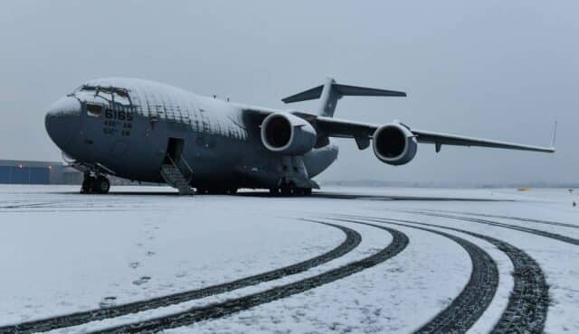
Did I mention I was part of the team that wrote the HUD for C-17?
All the effort I put into the canted pitch bars, FMA windows and “backward path” written in 1750A as compiled Jovial was too slow. And that’s what they do to her, the poor gal, all alone and out in the cold like that ;-)
X
You have NOT mentioned that, actually! That’s fascinating!
This one did get rescued!
Great cover for the new book!
Happy 2023!
Thank you and to you!
Oh yay! Can’t wait!
This made my day :D
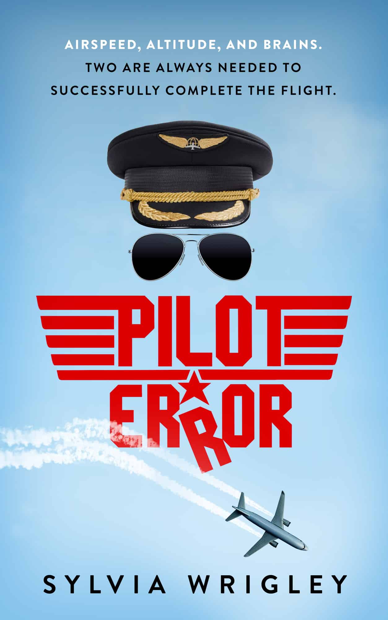
The cover art is counterproductive. First of all, the artist is going for a military type face, in the style of very commonly seen logo. Yet the artwork above the title shows the uniform and sunglasses associated with a commercial pilot. These therefore are incongruous and contradictory. Secondly the lettering is odd and the “R” in error is angled in such a way as to be confusing. It’s easily misread and just as easily passed over in a news stand. I urge another design or failing that another designer. Good luck
The R in “Error” looks too much like an “A”.The tops of “R” are easily mistaken for the letter A. Furthermore, the ‘Swoosh’ of the jet’s contrails add to the confusion with the R’s. I dont think you have the luxury of having a title misunderstood on a newstand. The title and cover should speak to the would be customer and pull them in. The current design does the opposite.
You got caught in the moderation queue; further comments will go straight through. I wasn’t 100% sure if you wanted both comments or if the second was a more detailed attempt after the first didn’t appear to get through.
Thanks for taking the time to point out what didn’t work for you — feedback is always useful!
The “Pilot” word is well framed but have to agree with “Error” being in error. It takes an effort to read that
Thanks; this is useful feedback!
I don’t want to sound overly critical but I agree with Mark that the “R’s” look like A’s and the swoosh separating the Error word makes it confusing. My suggestion would be to have the word Error all in one without the dropped R. The swoosh can be left in since the Error word will be aligned straight. I have all your books Sylvia and I can’t wait for the next one. Happy New Year for a safe healthy 2023 to everyone!!
The timing right now is “well, here’s the artwork, now where all all the words?” Ummmm.
Thanks for the thoughts on the artwork, I’m feeding it back.
Happy New Year, Sylvia!
Thank you for all you do. I can’t wait to get the new book!
Thank you! I’m still scribbling the last bits!
The cover art design is brilliant. I especially like the way the poorly flown airplane ruins the otherwise perfect symmetry of the page.
But I have this problem with it: The stylistic flourishes greatly impact the readability of the title words.
Whether you use the image on the book cover or on a poster or other advertising, you want the title words “PILOT ERROR” to leap directly into the viewer’s brain with an absolute minimum of interference.
I suggest the following changes:
The center three bars of the wings decoration should not touch the “P” and “T” of “PILOT”. They should be separated from the lettering by a distance similar to that between the letters “O” and “T”.
As Mark says, the “R”s in “ERROR” look like “A”s. This is a case where some stylistic flourish should be abandoned for the sake of readability.
Similarly, the “L” and “E” should not have beveled corners. For a book title, readability is vastly more important than style.
Other parts of the art, beyond the title, do not need to be so immediately apprehensible as language per se.
I have sent you an email with an attached image illustrating these suggestions. Please feel free to use it any way you please.
I got the email, thank you! It very much illustrates your point.
IMHO, what it basically boils down to is, it’s your book. If you’re happy with the cover, no one else’s opinion matters.
Hope you’re having a great week!
I definitely love the cover but I’ve asked the designer to take a look at those R’s for me.
some people just love being overly critical. I’m sure you’ve seen it a lot. The cover illustrates the purpose perfectly to me, but……..again, your book.
One author to another, can’t ever please everyone!
Typography on covers is an art; there’s always room for tension between legibility and neat design. e.g., the paperback edition of Beggars in Spain was known as “Beggars in Spam” for some time due to a too-florid and too-heavily-tracked font: see https://www.isfdb.org/wiki/images/b/b0/BKTG08506.jpg
That’s funny; I wasn’t aware of that but I can clearly see it in the image!
I’m not going to comment on the artwork other than to say that there’s always something strange about red on a blue or grey background that makes it difficult to read. Note the top line in red is not as clear as the white lines below it. A colour combination best avoided!
The Fear of Landing website uses pretty heavy image compression in order to keep my costs down. The top line in red reflects this, which supports your point and gives me something to watch out for!