New Design!
A few months ago I saw some people talking about Fear of Landing on Reddit, which was pretty cool, except that one of them said “Yeah, but what’s up with the 1990s web design, wow.”
I looked at my darling website, which actually was designed in 2006, thank-you-very-much, with a redesign in 2008, and I started to wonder if it was looking a bit dated. It’s not something I felt I could really ask people, akin to the “Do I look fat in this?” trap when shopping for clothes.
So I started to look at how I could redesign it. The homepage was very long and slow to load, so I really wanted to fix that. Another thing that has always frustrated me is how hard it is to find other articles that are interesting. Subscribers to the mailing list get a post every Friday; however a lot of people visit a single page and then never find older posts that are relevant or interesting.
My boyfriend is super amazing and after an evening discussing what I did and didn’t want, he started work on a new template for WordPress for me.
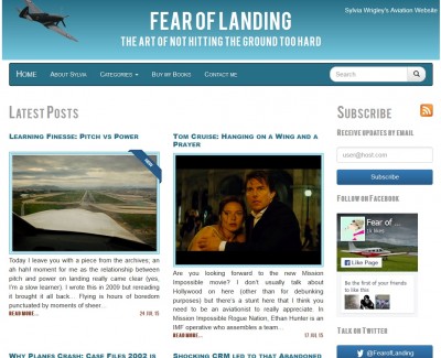
This is the result. I prefer to read black text on a white background (yes, I’m maybe a little old-fashioned) so the colour scheme is aimed at keeping it easy on the eyes. It’s a lot slicker and faster to load and the changes should make it easier to find things that you’d like to read. The combination of photographs and text makes it look a lot more modern (I HOPE).
There’s been a fair amount of work under the hood too, with better categories and the addition of a recommendation engine so when I post something new, I can link that post to similar posts that are related.
With all these changes, some parts of the site might not be working quite the way they should, so please, if you notice anything wrong, email me and let me know about it so we can fix it.
The new website is also responsive. It should work on all platforms and all devices from the smallest iPhone to the most obscure tablet. Again, if you find any combination where it doesn’t look quite right, please let me know.
PS: a HUGE thanks to Cliff for all the time he’s put into this. This totally makes up for stealing my chocolate.
Hi Sylvia. I like the new layout, it looks very professional. I didn’t have any complaints about the old one per se, but this one definitely looks better and more up-to-date. In fact, from what I’ve seen lately WordPress seems to have a more professional look in general than what Blogger offers me, but I’m comfortable with what I have set up there for now (runwaytwoseven.blogspot.com) and don’t have plans to jump ship to WordPress. Yet.
I always enjoy reading your blog – thanks for sharing!
Brian
https://twitter.com/n122vu
Thank you!
Nice, Sylvia. Good look to the site, and the colors are quite complementary. I like the layout too, and how the posts are easy to find. Nice improvements all around to the site, and accessing the archives blogs seems easy enough. Good on ya to both of y’all!
Thanks! And now your new email address is approved for comments so you won’t get put into the moderator queue in future. :)
Hello Sylvia, yes, nice new layout. I am pleased to have found your blog, it has a pleasant personal “atmosphere” I have not found elsewhere.
Thanks!
I wonder if you have many other readers in Finland?
Kai
I also have a new reply feature, which I love. I don’t know of any other readers in Finland, we’ll have to come up with a way to flush them out!
Yes, very nice indeed. But I don’t judge a book by its cover.
The old design, yes it was a bit dated.
Yes, the new look is very nice.
But the articles were spot-on. A joy read. As long as the content remains at the same level….
Anyway, congratulations Sylvia.
Haha, I’ll try to keep standards up. Thanks.